News
Smart and Practical Responsive Web Design Tips

News
 If you carry a smartphone in your pocket or keep a tablet propped up on the nightstand, you probably use those devices to check your email and surf the web. In fact, you probably use your smartphone and tablet for email checking and web surfing more frequently than you use a traditional desktop or laptop computer.
That fact has not gone unnoticed by marketers and web designers. The idea of responsive web design (RWD) first began to take hold some years back, but being responsive to mobile users has never been more important. In fact, search engine giant Google finds mobile friendliness so important that they have built it into their latest algorithm changes. If your website is not mobile-friendly, you could find yourself at the bottom of the search results, making your online property all but invisible to web users.
If you do not want to suffer that fate, you need to make sure your website is mobile-friendly, and that it is just as easy to read and use on a tiny smartphone screen as on a giant desktop computer monitor. Here are some smart tips you can use to incorporate responsive web design into your online properties:
. Use a mobile-first strategy. Building every website you create with mobile devices in mind is perhaps the best way to make sure everything you build is mobile friendly.
. Use prototyping software to build mobile friendliness into your online properties. Prototyping software can make every part of the process, from setting breakpoints to choosing the right layout, easier.
. Simplify mobile navigation with a drop-down menu. Navigating lots of buttons can be tricky on a mobile device, so consider using a single icon to open a drop-down menu with additional choices.
. Pay attention to look and feel. The look and feel of the site is critical for mobile devices, so design your site with that in mind. Build the interface layout first and go from there.
. Optimize your images for mobile use. Scale down your images, shrink them as much as possible and use compressed formats like JPEG and GIF.
. Set image sizes by entering exact measurements. This simple step eliminates scaling while preserving the quality and resolution of every image.
. Build up your toolbox. Creating a standard site for desktop computers is relatively easy and requires only a limited set of tools and software programs. Responsive web design is far more complex, so fill your toolbox with multiple editing tools and software programs.
. Make updates easy. Build instructions into the code to make it easier for others to update what you have done. The easier you make the update process the better off you will be.
. Limit the use of text. Long blocks of text are fine on the desktop version of your website, but they can be distracting and hard to read on mobile devices.
Responsive web design has never been more important than it is today, and it is important to build mobile friendliness into every website you create. The tips above can help you get started and improve the user experience across the board.
Start your Payanywhere account.
 |  |  |  |  | 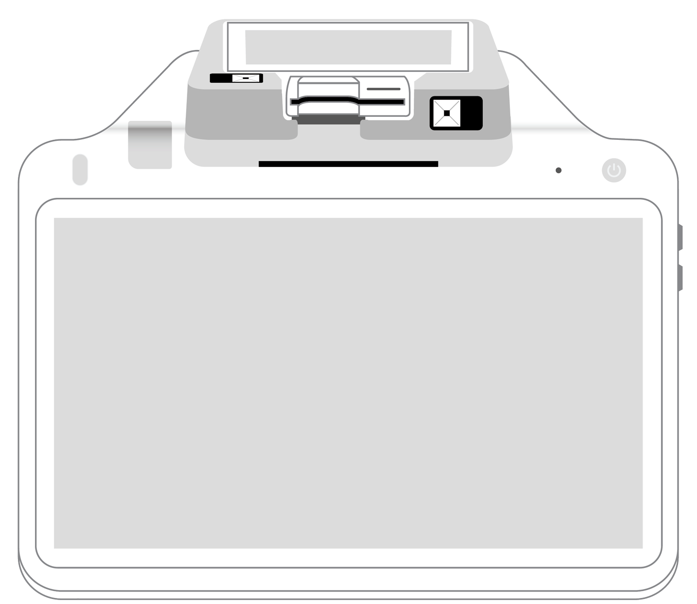 | |
|---|---|---|---|---|---|---|
Payment types | ||||||
EMV chip card payments (dip) | ||||||
Contactless payments (tap) | ||||||
Magstripe payments (swipe) | ||||||
PIN debit + EBT | ||||||
Device features | ||||||
Built-in barcode scanner | ||||||
Built-in receipt printer | ||||||
Customer-facing second screen | ||||||
External pinpad | ||||||
Wireless use | ||||||
Network | ||||||
Ethernet connectivity | With dock | |||||
Wifi connectivity | ||||||
4G connectivity | ||||||
Pricing | ||||||
Free Placement | ||||||